Trakor About Section
A section containing multiple containers with a two-column layout and an image grid.
View component
Xinder hero
Clean hero section featuring a form and quick links.
View component
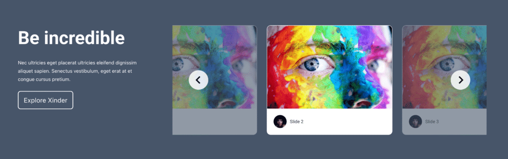
Xinder Testimonial Section
Testimonial section featuring a video slider.
View componentXinder Video Section
A clean two-column layout featuring a video, text, and links.
View component