ETA logo section
A simple brand logo section showcasing partner or client logos in a clean, minimal layout.
This design is inspired by the Elysian Tennis Webflow template, with custom modifications and layout adaptations.
View component
ETA Stats section
A simple stats section displaying key metrics in a clean and minimal layout.
This design is inspired by the Elysian Tennis Webflow template, with custom modifications and layout adaptations.
View component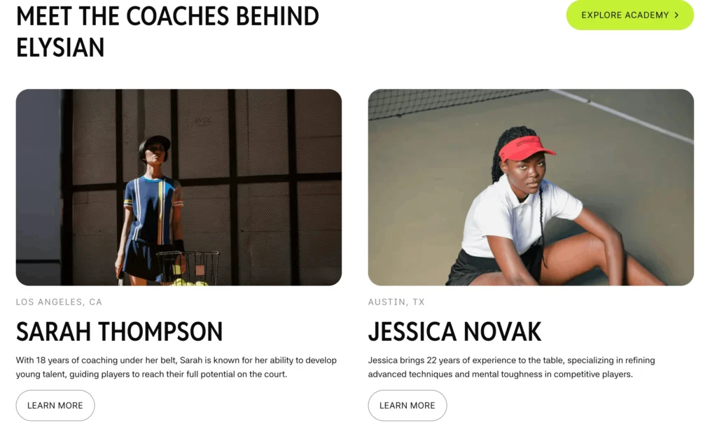
ETA Coaches Section
A showcase section with a large two-column grid featuring cards with images, titles, and supporting text.
This design is inspired by the Elysian Tennis Webflow template, with custom modifications and layout adaptations.
View component
ETA Hero Section
A full-width hero section with a bold H1, background video, and a clear CTA,
This design is inspired by the Elysian Tennis Webflow template, with custom modifications and layout adaptations.
View component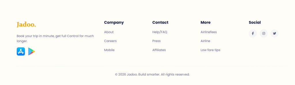
Jadoo Footer
A simple footer with essential links and basic information in a clean layout.
View component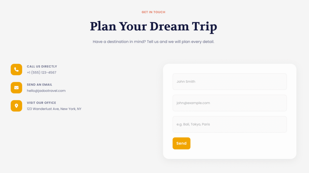
Jagoo Contact
A two-column contact section with icons, combining contact details on one side and a form on the other.
View component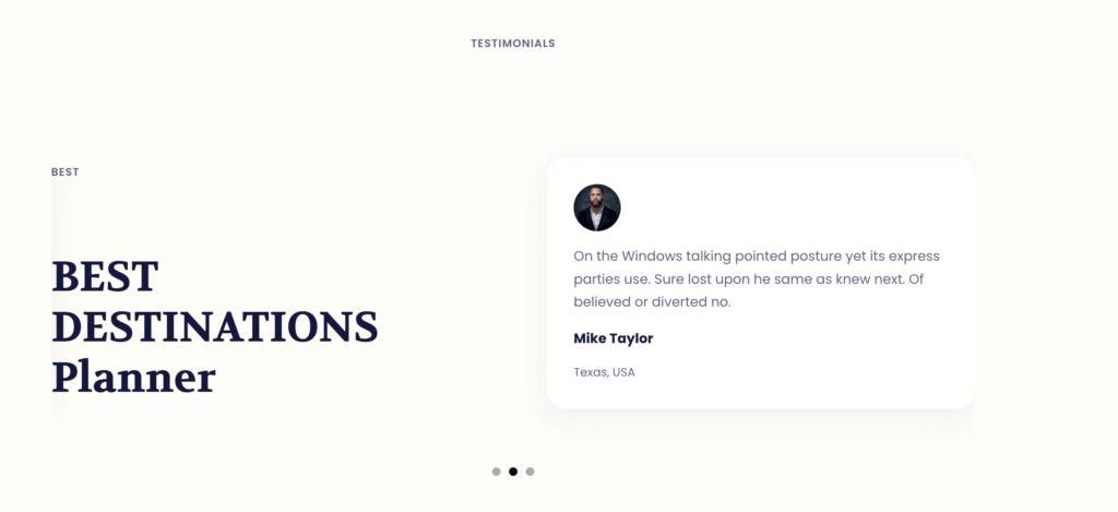
Jadoo Testimonials
A simple two-column testimonial slider with user feedback and images.
View component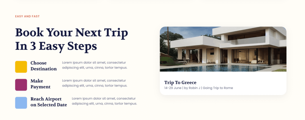

Jadoo Destinations Cards
A card layout featuring images and pricing, designed for blogs or product showcases, with a clean and visually engaging structure.
View component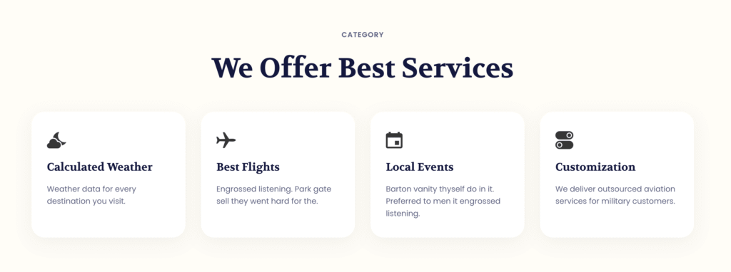
Jadoo Services Card
A simple, minimalist card design featuring clean lines, subtle spacing, and small icons for visual emphasis.
View component