Metric Kit Three-Column Layout
Three-column layout with customizable icons and call to action
View component

Number Counter Stats Banner
Simple number counter banner - perfect for displaying stats.
View component
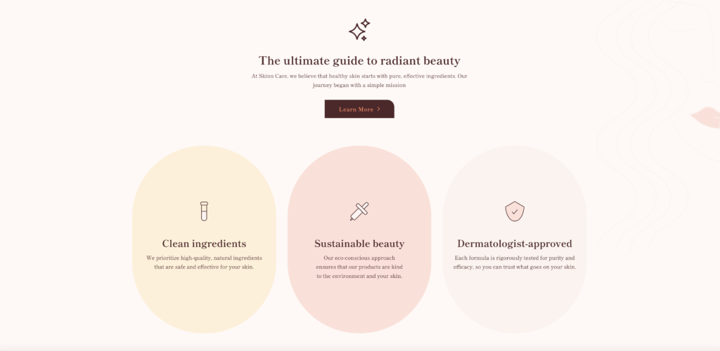
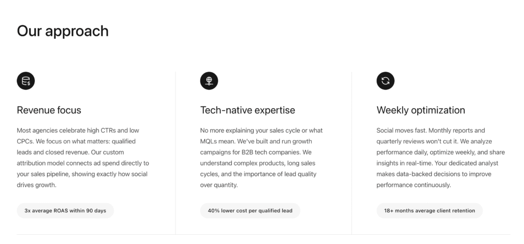
Features Section
Responsive section with cards; perfect for demonstrating product/service features and benefits
View component

Hero Section with curved image and background graphic
Hero section with a curved image and background graphics
View component
Responsive Navbar
Responsive Navbar including mobile menu coming onto screen from the right
View component