
Metric – Header with Mega Menu
Header featuring a mega menu with an optional inverted color scheme.
View component

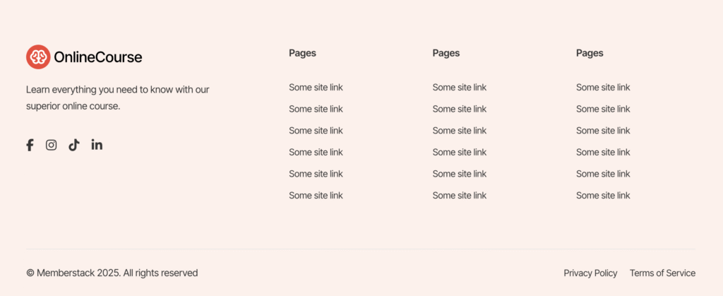
Standard Footer Component
Standard footer with brand info on the left, and site link columns to the right. Contains legal links at the bottom.
View component
Online Course Header
Header with links to pages on the marketing site + members only links powered by Memberstack attributes.
View component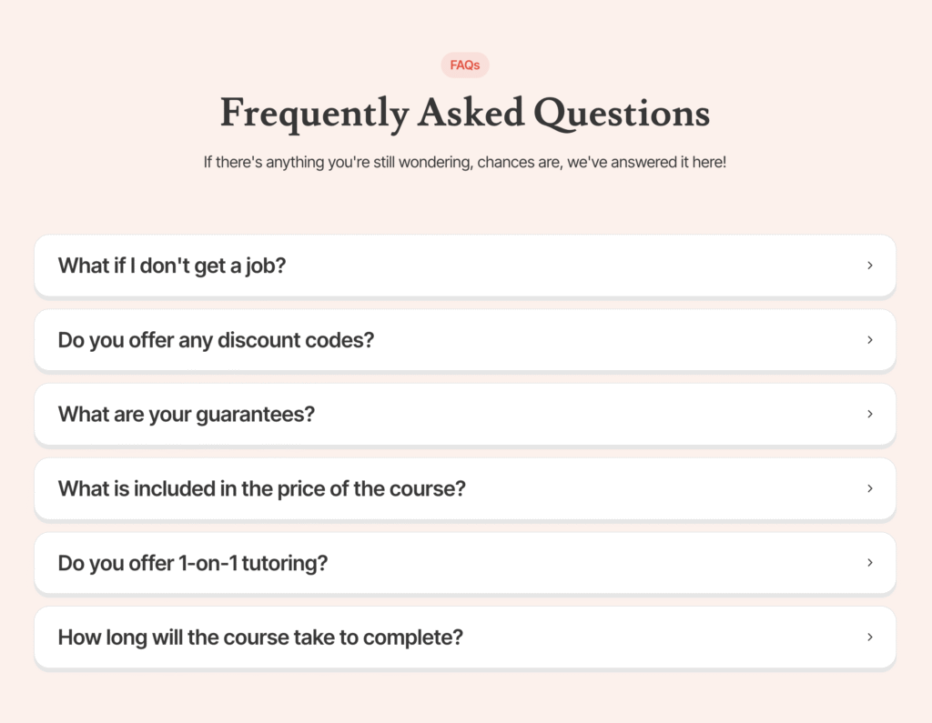
Beige FAQs Section
Animated accordions made to be FAQs - from our 2025 Online Course Template!
View component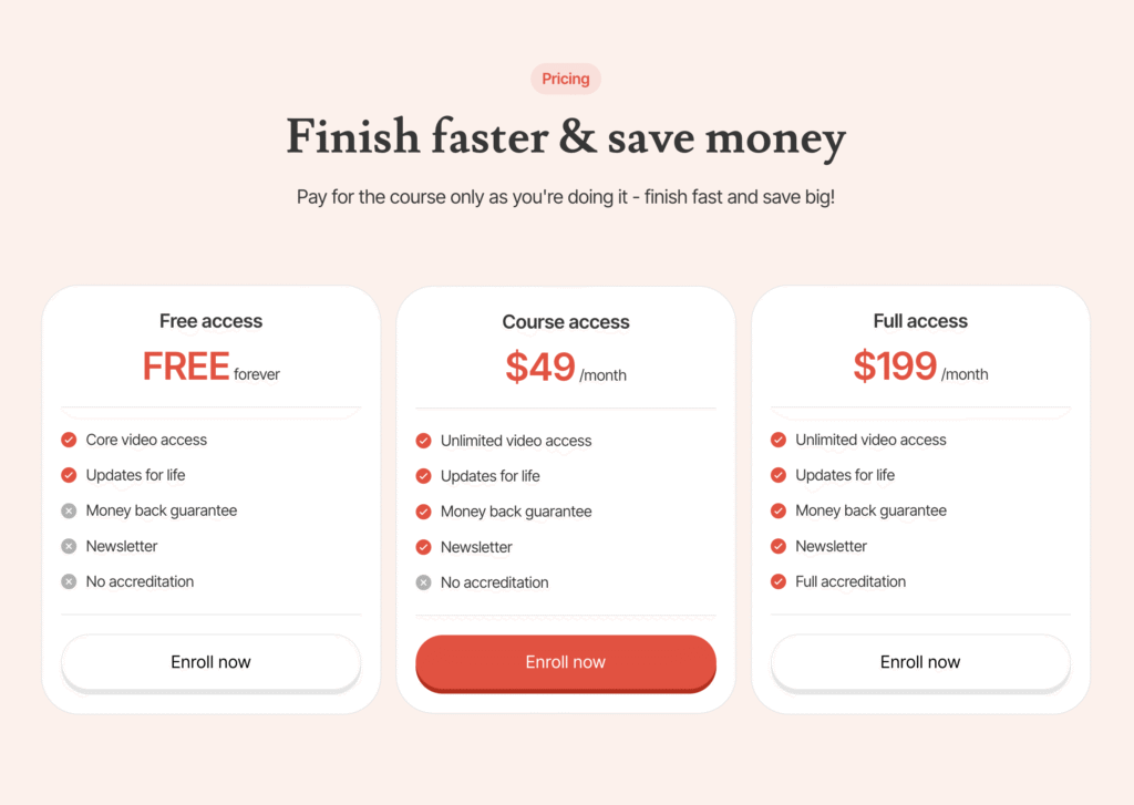
3 Tier Pricing Table
Red & Beige 3-tier pricing table with a free trial, an expensive plan, and a cheap plan.
View component
Left To Right Feature Section
A simple feature section with text and a button on the left, and an image on the right.
View component