

Estatein Kit – Testimonial Section
Client testimonial section with detailed reviews and information
View component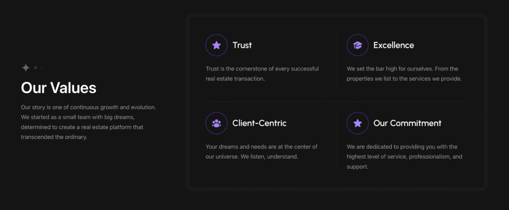

Estatein Kit – Featured Cards 3
Step-based cards section ideal for showcasing service steps
View component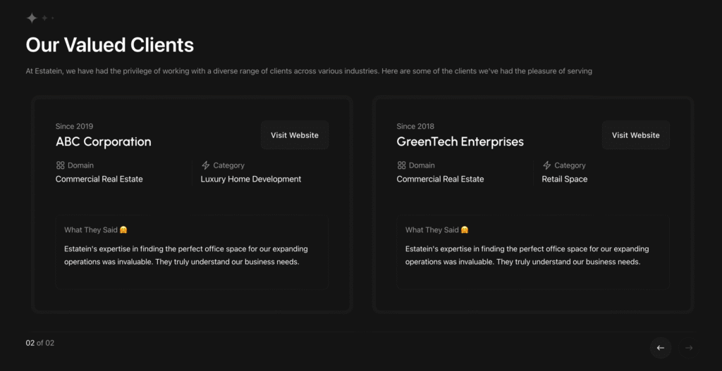
Estatein Kit – Testimonial Slider 2
Client testimonial slider (Needed Estatein — Fraction Pagination JS Code if you want fractions)
View component


Estatein Kit — Fraction Pagination JS Code
Bricks’ default slider pagination dots converted to fraction — only supported for Estatein Kit sliders. Instructions added
View component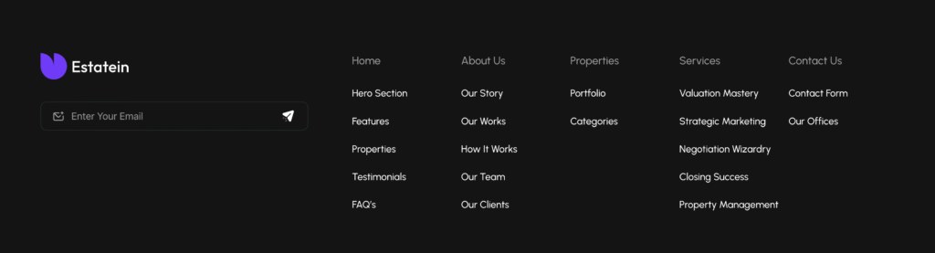
Estatein Kit – Footer
Footer featuring multiple columns, a dark background, and a newsletter email subscription
View component